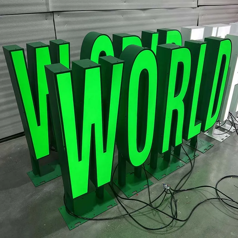
Choosing the right size for Channel Letters is not simply a matter of making the letters as large as possible.
The ideal letter size depends on where the sign will be installed, how far away people will view it, whether customers are walking or driving, the type of illumination, the font, the building façade, and even the surrounding nighttime brightness.
A 300 mm letter may work perfectly on an indoor reception wall but become almost invisible on a roadside commercial building. At the same time, oversized LED channel letters can look disproportionate on a small storefront and may increase production, installation, and shipping costs without improving visibility.
This Channel Letter Sizes Guide explains how to select practical letter dimensions for different applications and what buyers should consider before placing an order.
Why Channel Letter Size Matters
Size directly affects three important parts of a signage project:
Readability, visual proportion, and construction.
The larger the viewing distance, the larger the letters generally need to be. Letter height is therefore usually one of the first dimensions considered when designing commercial signs.
A commonly used signage rule of thumb is approximately 1 inch of letter height for every 10 feet of viewing distance, although this is only a starting point. Font style, contrast, installation height, viewing angle, traffic speed, and lighting conditions can all change the final recommendation.
For Channel Letters, there is an additional consideration: the letter needs enough internal space for LEDs, wiring, structural supports, and mounting hardware.
That means sizing must consider both visibility and manufacturability.
Start With Viewing Distance
The first question should be:
From where will most customers actually see the sign?
There is a major difference between a sign viewed from a hotel lobby and one viewed from a moving vehicle.
As a practical starting point:
| Typical Application | Approx. Letter Height |
|---|---|
| Reception wall / close-range interior | 100–300 mm |
| Indoor mall storefront | 200–500 mm |
| Small street-facing retail shop | 300–600 mm |
| Standard commercial storefront | 400–800 mm |
| Large building façade | 700–1,200 mm |
| High-mounted exterior sign | 1,000–2,000+ mm |
| Rooftop / long-distance architectural signage | Project-specific |
These are not fixed standards. They are useful design ranges.
Industry guidance also emphasizes that letter height should be determined by primary viewing distances, while stroke width, spacing, viewing angle, and local sign regulations should be considered at the same time.
Channel Letter Sizes for Storefront Signs
Storefront signs are one of the most common applications for Channel Letters.
For typical street-facing stores, restaurants, beauty salons, clinics, cafés, and retail businesses, letter heights between approximately 300 mm and 800 mm are common.
But the correct size depends on the street environment.
A pedestrian shopping street may only require 300–500 mm letters because customers are relatively close.
A store facing a parking lot or wider road may benefit from 500–800 mm letters.
A commercial façade viewed primarily from vehicles may require even larger lettering.
When designing storefront signs, consider:
- Distance from the road
- Building width
- Fascia height
- Mounting height
- Nearby competing signs
- Traffic speed
- Daytime contrast
- Nighttime illumination
The letters should feel visually balanced with the building rather than simply filling the entire available wall.
Channel Letter Sizes for Indoor Reception Walls
Indoor signage works very differently from exterior signage.
Customers may stand only 2–10 meters from the sign, so extremely large letters are usually unnecessary.
For reception areas, offices, salons, hotels, restaurants, and corporate branding walls, letter heights from approximately 100–400 mm are common.
Smaller Channel Letters are particularly suitable when:
- Viewing distance is short
- The wall is narrow
- The design includes several lines of text
- The sign is intended to look elegant rather than aggressive
- Halo lighting is used
However, small letters create manufacturing limitations.
If the stroke becomes too narrow, there may not be enough space for LEDs, wiring, acrylic returns, or welding.
This is why a production drawing should always be reviewed before manufacturing very small LED channel letters.
Channel Letter Sizes for Shopping Malls
Shopping malls require a balance between visibility and architectural control.
Typical mall signs are viewed from moderate distances and usually need to comply with landlord signage guidelines.
A common range is approximately:
250–600 mm letter height
For premium fashion stores and luxury boutiques, the letters may be relatively smaller because customers view them from nearby corridors.
For supermarkets, entertainment venues, or large anchor stores, the lettering can be substantially larger.
In shopping mall projects, overall sign width can sometimes matter more than individual letter height.
A long company name may require narrower lettering or a two-line arrangement to maintain a strong visual proportion.
Channel Letter Sizes for Hotels and Restaurants
Hotels and restaurants often require two different types of visibility.
The main exterior sign may need to be recognizable from a road or driveway, while interior branding may be viewed from only a few meters away.
For this reason, one project may use:
- Large front-lit Channel Letters outside
- Medium halo-lit letters at the entrance
- Smaller backlit letters behind reception
Exterior hotel signage may use letters between approximately 500 mm and 1,500 mm, depending on the building scale.
Interior hotel signs may only require 150–400 mm letters.
Restaurants located in busy commercial streets often benefit from bright front-lit signage because fast name recognition is more important than subtle decorative lighting.
Channel Letter Sizes for Large Commercial Buildings
When letters are mounted high on a façade, the apparent size changes dramatically.
A 600 mm letter can look large when placed at eye level but surprisingly small when installed 10 meters above the ground.
Large commercial buildings commonly use:
- 800 mm letters
- 1,000 mm letters
- 1,500 mm letters
- 2,000 mm or larger letters
At these dimensions, structure becomes increasingly important.
Larger Channel Letters require more metal, more LEDs, stronger internal reinforcement, larger fixing points, and more substantial packaging.
HLW Sign’s own production guidance also notes that sign size directly affects material use, LED quantity, labor, packaging, and structural requirements.
How the Type of Channel Letter Changes the Recommended Size
Not every Channel Letter construction works equally well at every size.
Front-Lit Channel Letters
Front-lit letters usually provide the strongest direct visibility.
They typically use:
- Acrylic face
- Aluminum or stainless-steel returns
- Internal LED modules
- Metal or PVC backing
Because the illuminated face points directly toward the viewer, front-lit letters work well for medium and large exterior signage.
They are especially practical for:
- Retail stores
- Restaurants
- Shopping centers
- Clinics
- Car dealerships
- Commercial buildings
For long viewing distances, front-lit letters are often more effective than a subtle halo-only sign.
Backlit Channel Letters
Backlit or halo-lit Channel Letters create light behind the letters rather than through the front.
This effect is usually more refined but less aggressive.
Backlit signs are therefore particularly suitable for:
- Hotel entrances
- Office reception walls
- Premium retail
- Salons and spas
- Restaurants
- Corporate headquarters
With backlit letters, size should also be considered together with the stand-off distance from the wall.
HLW Sign typically evaluates factors such as letter height, return depth, LED brightness, wall color, and viewing distance when designing halo-lit letters.
A small backlit sign installed too far away may produce an overly soft halo, while a large letter mounted too close to the wall may create an uneven glow.
Front and Back Lit Channel Letters
Dual-lit Channel Letters combine a bright illuminated face with a rear halo.
They are useful when both visibility and premium appearance matter.
Common applications include:
- Shopping-center façades
- Hotels
- Beauty salons
- Restaurants
- Fashion stores
- Corporate buildings
For long-distance signage, the illuminated face usually provides most of the useful readability, while the halo contributes depth and visual separation from the wall. HLW Sign
This is an important point when choosing letter size: more lighting does not necessarily mean a smaller sign can be used.
Viewing distance still matters.
Perforated Channel Letters
Perforated Channel Letters create decorative points of light through holes in the metal surface or returns.
These letters generally work better when the size allows sufficient space for:
- Perforation patterns
- LEDs
- Internal structure
- Reliable metal fabrication
For example, HLW Sign‘s perforated Channel Letters typically require adequate stroke width and character dimensions so that the lighting pattern remains visible and the structure remains practical to manufacture.
You can explore HLW Sign’s custom Channel Letters and illuminated signage options here:
HLW Sign Channel Letters & LED Sign Products
For customers interested specifically in decorative perforated structures, HLW Sign also manufactures:
Custom Perforated LED Channel Letters
Brightness Also Affects Channel Letter Size
Buyers often assume that brighter LEDs can compensate for smaller letters.
This is only partially true.
Brightness improves nighttime visibility, but it does not solve every readability problem.
A letter that is physically too small for the viewing distance will still be difficult to read.
Increasing LED output excessively can also create:
- Glare
- Hot spots
- Uneven acrylic illumination
- Excessive halo brightness
- Poor nighttime comfort
The correct approach is to balance:
letter size + contrast + lighting output + viewing distance
rather than maximizing LED brightness alone.
Daytime Visibility Matters Too
Channel Letters are not only viewed at night.
During the day, the viewer primarily sees:
- Letter size
- Font
- Face color
- Return color
- Wall contrast
- Spacing
For example, white letters mounted on a white wall may have poor daytime contrast even if they look excellent at night.
A darker return, contrasting backing panel, or larger letter size can sometimes improve daytime visibility more effectively than stronger LEDs.
For storefront signs, daytime readability should therefore be reviewed before the illumination effect is finalized.
Font Style Can Change the Required Size
Two fonts with the same nominal height may have very different readability.
Bold sans-serif letters are generally easier to recognize from a distance than:
- Thin serif fonts
- Script fonts
- Calligraphy
- Decorative fonts
- Condensed fonts
Industry guidance on sign visibility also notes that decorative and script fonts typically need larger sizing because they are harder to read at smaller dimensions.
For custom Channel Letters, font selection also affects production.
Very thin strokes can make it difficult to install LEDs or fabricate metal returns.
That is why letter height should never be evaluated separately from stroke width.
Stroke Width Is as Important as Letter Height
Imagine two letters, both 500 mm high.
One uses a wide bold font.
The other uses an extremely thin luxury serif font.
Although the height is identical, the internal manufacturing space is completely different.
The narrow letter may have very little room for:
- LEDs
- Wiring
- Screws
- Acrylic bonding
- Structural support
For this reason, HLW Sign reviews artwork before production and may recommend slightly increasing the size or adjusting the font when strokes become too narrow.
The goal is to preserve the brand style while ensuring reliable production.
Installation Height Changes Perceived Size
One of the most common mistakes when ordering Channel Letters is evaluating the sign only on a computer screen.
A letter may appear large in artwork but look very small once installed high on a building.
The higher the sign is mounted, the more consideration should be given to:
- Viewing distance
- Viewing angle
- Building scale
- Letter spacing
- Overall sign width
Letters mounted well above eye level often need to be larger than letters viewed directly at eye level.
This is particularly important for:
- Shopping centers
- Warehouses
- Car dealerships
- Hotels
- Commercial office buildings
- Rooftop signage
Wall Size and Building Proportion
The largest possible letters are not always the best choice.
A well-designed sign needs some visual breathing room around it.
As a practical design approach, avoid filling the entire available façade with lettering unless the architectural concept specifically requires it.
Consider:
- Left and right margins
- Top and bottom margins
- Logo-to-text proportion
- Number of words
- Overall building width
A balanced 4-meter-wide sign on a 6-meter façade may often look more premium than forcing the design to fill all 6 meters.
Viewing Speed Matters
Pedestrians have more time to read a sign than drivers.
This means roadside Channel Letters often need:
- Larger letter height
- Simpler fonts
- Stronger contrast
- Clearer spacing
A sign that is perfectly readable while standing still may be much harder to understand when viewed from a vehicle traveling at speed.
For this reason, highway-facing commercial buildings, service stations, retail parks, and car dealerships usually need larger signage than pedestrian-oriented retail streets.
Letter Spacing Can Be More Important Than Making Letters Bigger
Poor kerning can reduce readability even when the letters are large.
If letters are placed too close together, individual shapes begin to merge visually.
If they are spaced too far apart, the company name loses visual unity.
Good spacing helps the viewer recognize the word quickly.
This is especially important for:
- Long company names
- Condensed fonts
- Script lettering
- Large façade signs
When overall installation width is limited, it may be better to choose a slightly narrower font rather than reduce every letter to an unreadable size.
Local Sign Regulations Can Limit Channel Letter Size
Commercial signage may be regulated by:
- Local authorities
- Building owners
- Shopping-center landlords
- Historic districts
- Planning authorities
Rules may restrict:
- Maximum sign area
- Letter height
- Overall width
- Illumination intensity
- Sign position
- Projection from the façade
Therefore, final Channel Letter sizes should be confirmed against local regulations before manufacturing.
This is especially important for large exterior signage.
Electrical Safety Should Scale With the Sign
Larger illuminated signs normally require more LED modules and higher electrical loads.
This makes proper power-supply sizing, wiring, waterproofing, and electrical protection increasingly important.
For electric signs used in North America, UL 48 is a key safety standard covering electric signs and associated construction considerations.
Learn about UL requirements for electric signs
The electrical design should therefore be selected together with the physical dimensions rather than added as an afterthought.
Practical Channel Letter Size Recommendations
A useful way to approach sizing is to start with the application rather than asking:
“What is the standard Channel Letter size?”
There is no single standard.
Instead, ask:
How will the customer see the sign?
For close-range reception signage, 150–300 mm may be enough.
For a typical storefront, 400–700 mm may be appropriate.
For a large commercial building, 800–1,500 mm or more may be required.
For rooftop or long-distance signage, sizing should be calculated according to the actual building and viewing distance.
Why Small Channel Letters Can Be More Difficult to Manufacture
Smaller does not always mean easier.
Very small illuminated letters can actually require more precision because internal space is limited.
Common problems include:
- LED modules do not fit
- Light spots become visible
- Thin strokes are difficult to weld
- Wiring becomes crowded
- Acrylic faces become difficult to bond
- Halo lighting becomes inconsistent
At HLW Sign, smaller illuminated letters are evaluated according to the actual font and structure before production.
In some cases, changing the lighting method or slightly increasing the letter height produces a much better result.
Why Oversized Channel Letters Need More Engineering
Large Channel Letters create different challenges.
Once the letters become very large, manufacturers must consider:
- Metal thickness
- Wind load
- Internal reinforcement
- Letter segmentation
- Lifting points
- Installation brackets
- LED access
- Packaging
- Shipping volume
The sign may need to be produced in multiple sections and assembled during installation.
This is why large architectural signage should be designed from a production and installation perspective from the beginning.
Choosing the Right Channel Letter Size With HLW Sign
HLW Sign has been manufacturing custom illuminated signage since 2010 and supplies projects to international markets. The company manufactures multiple Channel Letter structures, including front-lit, backlit, dual-lit, RGB, acrylic, stainless-steel, and perforated designs.
Before production, customers can provide:
- Vector artwork
- Available installation dimensions
- Wall photographs
- Viewing distance
- Installation height
- Indoor or outdoor location
- Desired lighting effect
- Destination country
Based on this information, HLW Sign can recommend a practical letter height, structure, return depth, LED layout, material, and mounting method.
This approach is more reliable than choosing a Channel Letter size based only on appearance in a rendering.
Final Channel Letter Size Checklist
Before confirming your Channel Letters, check the following:
- What is the main viewing distance?
- Will customers be walking or driving?
- How high will the sign be mounted?
- What is the available wall width and height?
- Is the font bold, condensed, or decorative?
- What is the minimum stroke width?
- Is the sign front-lit, backlit, or dual-lit?
- How bright is the surrounding environment?
- Is nighttime visibility important?
- Does the wall provide sufficient contrast?
- Are there local signage restrictions?
- Can the letters be manufactured and shipped as single pieces?
If these factors are reviewed before production, the final sign will usually look more proportionate, remain more readable, and be easier to install.
Conclusion: What Size Should Channel Letters Be?
There is no universal answer to the ideal Channel Letter sizes.
The correct size is determined by a combination of:
viewing distance, installation height, application, font, lighting style, brightness, wall conditions, building proportion, and manufacturing requirements.
For small indoor signs, letter heights of 100–300 mm may be sufficient.
For typical storefront signs, approximately 300–800 mm is common.
For large exterior buildings, letters may need to exceed 1 meter.
The goal should not be to make Channel Letters as large or as bright as possible. The goal is to choose a size that delivers clear visibility, proper proportion, reliable illumination, and practical fabrication.
For custom LED channel letters, HLW Sign can review your logo, installation dimensions, wall photos, and viewing conditions before production and recommend a suitable size and structure for your project.
Explore HLW Sign custom Channel Letters and illuminated signage