


Two shops on the same street can order identical led backlit letters for their shopfront, the same size and the same brightness, and still end up with one sign that looks premium and one that looks cheap. The difference is usually the colour temperature — the white you chose — and whether it suits what is being sold underneath it.
This guide explains what colour temperature is, what each range does to the look of a shopfront, and which white we specify for the applications we quote most often. If you spell it the American way, colour temperature is what most of our US customers call color temperature; it is the same number, measured in Kelvin.
What colour temperature actually means
Colour temperature describes how warm or cool a white light looks, measured in Kelvin (K). Counter-intuitively, the lower the number the warmer the light: 2700K is the colour of a candle or an old incandescent bulb, while 6500K is the colour of an overcast sky.
White LEDs do not produce white directly. A blue LED die is coated with a phosphor that converts part of that blue light into warmer wavelengths, and the mix of the two is what your eye reads as white. That is why two LED modules rated 4000K can still look slightly different: the phosphor mix varies from batch to batch, which is why we buy modules in the same production bin for every letter in a set. The technical background is worth ten minutes if you like the detail.
The four ranges that cover almost every sign
| Range | Character | Where it works | Where to avoid |
|---|---|---|---|
| 2400 to 2700K | Candle warm, amber tint | Bars, restaurants, hotels, heritage frontages, timber and stone | Pharmacies, gyms, anything that needs to look clinical or clean |
| 3000 to 3500K | Warm neutral, flattering | Fashion retail, jewellery, salons, cafes, boutique hotels | Budget forecourts where maximum visibility is the point |
| 4000K | Neutral, honest colour | Offices, clinics, supermarkets, car showrooms, custom 3d letters for reception areas | Restaurants and bars, where it reads cold and office-like |
| 5000 to 6500K | Cool to daylight | Pharmacies, fast food, gyms, forecourts, malls, security lighting | High-end retail, hospitality, residential streets after dark |
Matching the white to the application
This is the table we work from. “Brightness” is the light output at the face of the letter rather than the rating of the LED module, because that is what the customer actually sees.
| Application | Colour temperature | CRI | Brightness and control |
|---|---|---|---|
| Luxury retail and jewellery | 3000K | 90+ | Moderate, dimmable — the product must stay the brightest thing in the frame |
| Fashion and apparel | 3500K | 85+ | Moderate, even, no hotspots on the face |
| Restaurant and cafe | 2700K | 85+ | Low and dimmable; warm light makes food and skin tones look right |
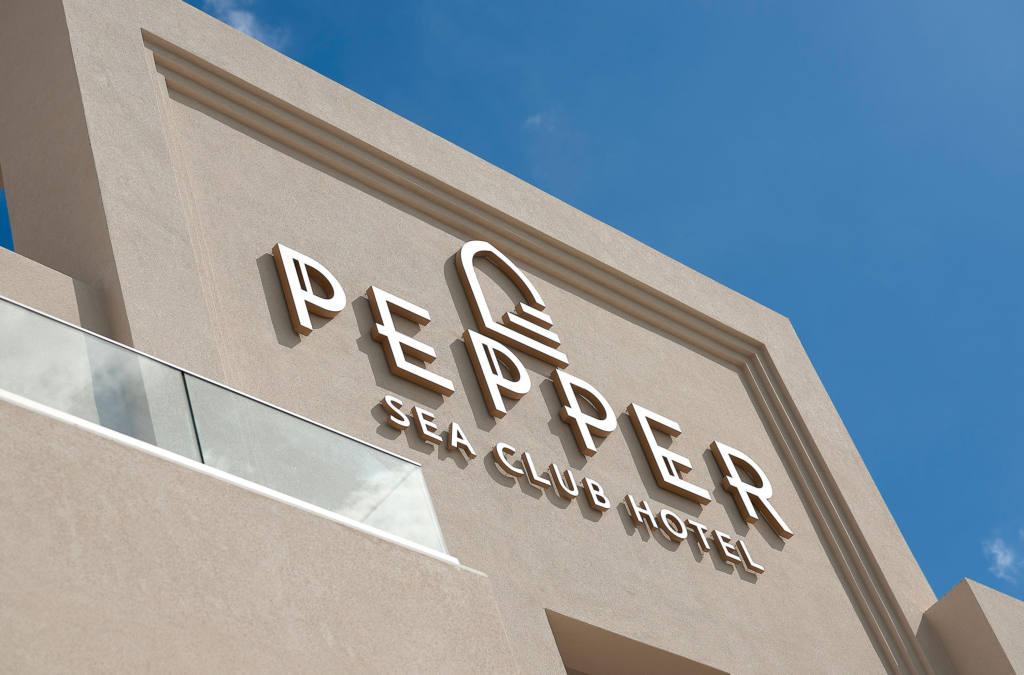
| Hotel facade and entrance | 3000K | 80+ | Moderate; matches interior lighting seen through the glass |
| Hotel lobby and reception | 2700 to 3000K | 90+ | Layered with downlights, dimmable to evening level |
| Bar, lounge and club | 2400K or tunable | 80+ | Very low, warm, or switchable to colour for events |
| Pharmacy and clinic | 5000K | 90+ | Even and bright; cool white signals cleanliness and helps colour judgement |
| Dental and medical suites | 4000 to 5000K | 90+ | Bright, no flicker, dimmable for evening |
| Supermarket and grocery | 4000K | 85+ | Bright and uniform; 3500K over fresh food |
| Gym and fitness | 5000K | 80+ | Bright; cool light reads as energetic |
| Nail studio and beauty | 4000K | 90+ | Neutral and accurate — customers compare polish colours under it |
| Spa and wellness | 2700K | 90+ | Low and warm; a cool white here undoes the whole interior |
| Car dealership and forecourt | 5000 to 6500K | 80+ | Bright, high output; cool white keeps metal looking clean |
| Office facade and corporate | 4000K | 80+ | Neutral; matches the interior specification |
| Fast food and takeaway | 5000K | 80+ | Bright; readable from a moving car |
| Church and community hall | 2700 to 3000K | 85+ | Warm, low glare, dimmable |
| Cinema and theatre frontage | 2700K | 90+ | Low, dimmable, no spill onto the pavement |
| Coastal and humid locations | Same as inland | Same as inland | Same colour temperature, but IP65+ and 316 fixings |
In practice a store front sign for a cafe or restaurant usually lands in the 2700K to 3000K range, while fashion and beauty sit at 3000K to 3500K. The two are only a few hundred Kelvin apart, which is why we send a physical sample rather than a photograph when the decision is close.
Brightness and the Kruithof effect
Colour temperature and brightness cannot be chosen separately. At low light levels the eye prefers warmer whites; as illumination rises, the preference shifts toward cooler whites, and a light source that looks cosy at 100 lux looks dingy at 800 lux. You can think of the whole subject in terms of how much light a space needs.
In signage the mistake is usually too much light, not too little. An over-bright cool-white sign at night:
- Glows into surrounding windows and creates complaints from neighbours;
- Reduces contrast with its own surroundings, so the sign becomes harder to read rather than easier;
- Hides the interior, because the eye adapts to the brightest object in view and everything behind the glass goes dark.
That is why we specify output in relation to the viewing distance and the surrounding light level, and why we nearly always recommend a dimming schedule: full output for opening hours, stepped down by 50 to 70 percent after closing. A dimmed 3000K sign at midnight looks far more expensive than a 6500K sign running at full power.
CRI: the number that decides whether reds look red
Colour temperature tells you how warm the light looks. The colour rendering index tells you how faithfully it shows colour. A 3000K module with a CRI of 70 will make a red logo look muddy and a cream wall look grey; the same colour temperature at CRI 90 will not.
For most signage a CRI of 80 or better is fine. We move to 90 or above when colour accuracy sells the product: jewellery, fashion, fresh food, cosmetics, nail studios, galleries and any brand whose identity depends on one specific colour.
CRI is not the only measure — it is calculated from a small set of test colours, and red rendering in particular can be poor even when the overall score looks respectable. If a brand colour matters, send us the Pantone reference and we will match it on the bench and photograph the result for approval before production.
How the lighting method changes the white
The same module produces three different effects depending on how it is mounted:
- Front lit custom channel letters for shopfronts — the light passes through an opal acrylic face, which diffuses it evenly and tends to cool the colour very slightly. Depth of cabinet and module spacing decide whether the face looks even or blotchy.
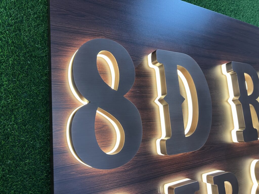
- Back lit and halo lit letters — the light bounces off the wall behind the letter. A cream or sandstone wall will warm the glow noticeably; a dark grey wall will absorb it and make the sign look dimmer than the sample. Specify the wall colour with the order, or we are guessing.
- Edge lit acrylic and light boxes — in a led light sign for a retail window, the light travels through the panel and picks up any tint in the acrylic, so opal, frosted and clear faces behave differently.
Faces with metal returns behave differently again: a backlit logo sign for a hotel lobby with brushed stainless sides reflects a tint back onto the face, so the perceived white shifts a second time.
Consistency across a set of letters
“Why is the W in my sign a different white from the H” is the most common colour complaint we hear, and it is nearly always one of four causes:
1. Modules from different production bins. Always order the whole set in one batch, and keep spares from the same batch for future repairs. 2. Voltage drop. On long runs the last letters get less current and dim slightly, which reads as a colour difference. We split long runs across multiple drivers rather than accepting the drop. 3. Mixed ages. A replacement module fitted three years later will never match exactly — this is why we ship spare modules with the original order. 4. Face material differences. Clear and opal acrylic in the same sign read differently even with identical modules.
Switching, dimming and changing colour later
There are three levels of control, and it is worth deciding before production because the driver, the wiring and the price all change:
- Single colour temperature plus dimming. The simplest option: one white, dimmed on a timer, photocell or wall switch. Colour stays consistent at every level because we dim by pulse width modulation rather than by reducing voltage.
- Tunable white (typically 2700 to 6500K). Two channels of warm and cool white mixed to order, so you can run warm in the evening and neutral by day, or match a brand specification exactly. Useful for hospitality and for retailers who change their window displays.
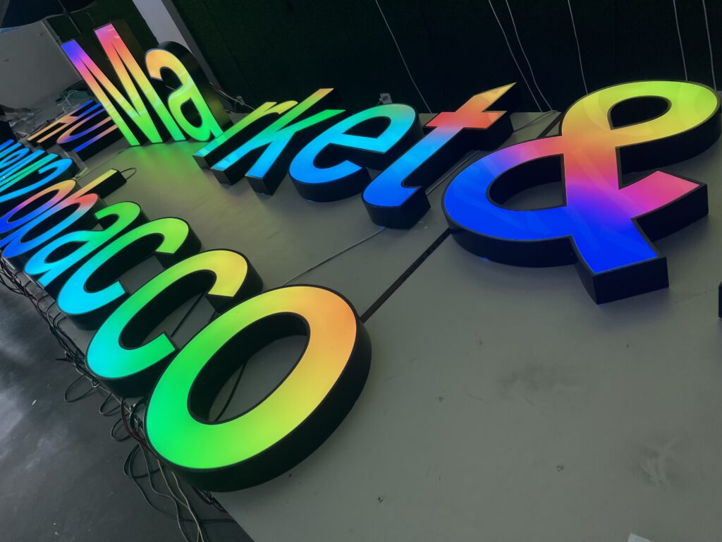
- Full colour (RGB or RGBW) — a rgb sign for bars and nightclubs changes colour on demand, controlled by DMX or an app. Because it changes colour, it loses the “single premium white” effect of a good tunable white system; the best of both is RGBW, which adds a dedicated white channel.
Changing the colour temperature after the sign is built means changing the modules, so it is worth getting the decision right at quotation stage.
Neighbours, permits and curfews
Bright signage that spills light into surrounding homes attracts complaints, and enough complaints turn into planning conditions. Two practical defences:
- Dim or switch off after trading hours, either on a timer or a photocell.
- Point the light where the sign is, not outward. Halo and back-lit letters are less likely to cause light spill than a bright face-lit sign aimed at a road.
Many of our customers on residential streets run their commercial outdoor signage at 30 percent between 11pm and 6am. It keeps the brand visible, cuts energy use and removes the main reason neighbours call the council.
Five mistakes we see most often
- Choosing 6500K because it looks brightest in the showroom, then discovering it looks blue and cheap on a brick wall.
- Mixing colour temperatures between a facade sign, a window sign and interior lighting on the same building.
- Specifying a warm white for a pharmacy or a cool white for a restaurant, against the logic of what is being sold inside.
- Ignoring CRI on products where colour accuracy is the whole point.
- Running a single driver on a long letter run, then blaming the modules for the colour difference at one end.
Frequently asked questions
What colour temperature is best for a backlit sign?
For retail and hospitality, 3000K is the safest general answer and 2700K is warmer for restaurants and bars. For offices, clinics and supermarkets 4000K is neutral and clean. Cool white at 5000 to 6500K suits pharmacies, forecourts and gyms. The deciding question is not what looks best in isolation but what the shop sells.
Is 3000K or 4000K better for a storefront?
3000K for fashion, food, beauty and hospitality, where warm light flatters people and products. 4000K for anything that has to read as clean, technical or spacious: offices, clinics, supermarkets, showrooms. If your window displays are compared side by side with the pavement outside, 3500K is the useful compromise.
What is the best colour temperature for a hotel sign?
3000K on the facade, and 2700 to 3000K inside, with the same white in both so the interior seen through the glass matches the sign outside. Cool white on a hotel usually reads as budget, because it flattens the materials the interior was built from.
Do backlit letters look different in daylight?
Yes. During the day you see the face material and the metal returns, not the light. Warm white or cool white makes no difference until dusk, which is why the daytime appearance should be specified from the face material, and the nighttime appearance from the module.
Can I change the colour temperature after the sign is made?
Not with a single-colour system: it means changing the modules. If there is any chance you will want a different white later, order tunable white (2700 to 6500K) at the start — the extra cost is far less than rebuilding the letters.
Why do my channel letters look like different shades of white?
Usually because the modules came from different production batches, or because the last letters on a long run are receiving less voltage. Order the whole set in one batch, split long runs across several drivers, and keep spare modules from the same batch for repairs.
What CRI should sign LEDs have?
CRI 80 is acceptable for general signage. Specify CRI 90 or above wherever colour accuracy matters — jewellery, fashion, fresh food, cosmetics, nail studios and galleries — and always verify your brand colour on a physical sample rather than on a screen.
How bright should an illuminated sign be?
Bright enough to be read at the distance that matters, and no brighter. Signs that outshine their surroundings lose contrast and attract complaints. A practical approach is to light for the pavement and the near lane, then dim by 50 to 70 percent after closing using a timer or photocell.
Sources and further reading
- Color temperature — how Kelvin maps to the white you see.
- Color rendering index — what CRI measures, and what it misses.
- Kruithof curve — why the right white depends on the light level.
- Illuminance — lux, foot-candles and how to compare specifications.
- Light pollution — light spill, glare and why neighbours complain.
Not sure which white your project needs?
Send us the type of business, a photo of the shopfront taken at night, and the interior lighting you already have. We will recommend the colour temperature and CRI, show you the difference on a physical sample if you want one, and quote it with the driver and dimming options included. You can see the range on our illuminated signs for retail and hospitality hub, and if you are planning something freestanding, our giant light up letters for parties range uses the same white matching.