
Introduction: A Storefront Sign Is the First Sentence of Your Brand Story
When a customer drives past a store at 50 km/h, they may have only a few seconds to decide whether that place feels worth stopping for.
Before customers read your menu, taste your product, or speak with your team, they experience one thing first: your store front sign.
A sign does more than display a business name. It communicates personality, quality, and trust before a customer ever walks through the door.
Is this place traditional or modern?
Affordable or premium?
Local and authentic or corporate and standardized?
Those judgments happen almost instantly.
Research in consumer psychology has repeatedly shown that first impressions strongly influence later perceptions of a brand. In physical retail environments, the storefront becomes the visual introduction between a business and its community.
That is why successful businesses do not treat signage as a simple advertising tool.
They treat it as a long-term brand asset.
A well-designed store front sign can become a landmark, a neighborhood memory, and sometimes even part of a community’s identity.
The stories of nine independent businesses show an important lesson: the best signs are not simply beautiful. They explain who a business is.
From a shop once criticized for having one of the “worst names” to historic neighborhood stores rebuilding their identity through modern illumination, these businesses prove that signage is not just about visibility.
It is about storytelling.
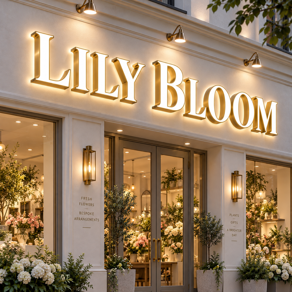
Story 1: Latinx with Plants — When a Sign Becomes Cultural Identity
Located in Los Angeles, Latinx with Plants is more than a plant shop. It represents a community, a culture, and a creative philosophy.
Founder Andi Xoch described the original hand-painted sign as something much deeper than a logo.
Inspired by the Mexican-American concept of rasquachismo — creating beauty and meaning from limited resources — the sign was originally created by a local female artist.
Over time, the artwork evolved.
Old layers remained visible.
Previous versions were not erased completely.
Instead, the storefront carried traces of its own history.
As Andi explained, in Los Angeles, signs are not only signs. They can become pieces of history, art, and resistance.
This story changes how we think about a custom storefront sign.
A sign does not always need to look brand new forever.
Sometimes the marks of time create authenticity.
For independent retailers, restaurants, and lifestyle brands, customers are increasingly attracted to businesses that feel human rather than manufactured.
A carefully designed sign can communicate:
- local identity
- craftsmanship
- community connection
- brand personality
This is why many modern businesses choose custom solutions such as dimensional metal letters, handcrafted logos, and illuminated signage instead of generic printed boards.
A professionally manufactured custom illuminated storefront sign for small businesses can combine modern durability with the emotional qualities that make independent brands memorable.
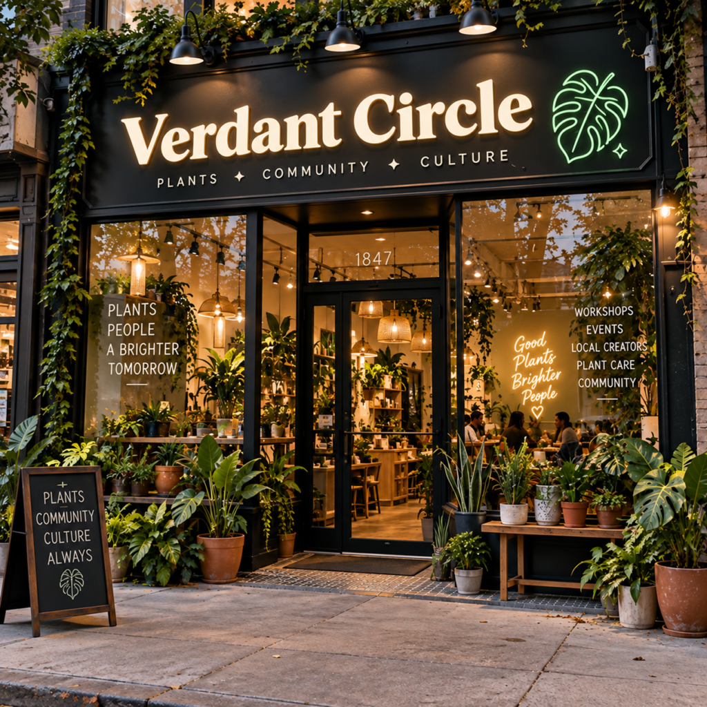
Story 2: Dead People’s Stuff — When a Sign Explains the Brand Before Customers Enter
A name like “Dead People’s Stuff” immediately creates curiosity.
This Oklahoma City antique store understood something important:
The sign itself had to explain the personality of the business.
Instead of choosing a traditional antique shop symbol, owners Curran and Marymar Fudge created a visual identity inspired by the Mexican Day of the Dead tradition.
The skull represents death.
The butterfly represents transformation and new life.
Together, the imagery tells a complete story.
The lesson is not that every business needs an unusual name.
The lesson is that a successful storefront sign should answer a customer’s silent question:
“Why should I remember you?”
For retail businesses, the strongest signage often combines three elements:
1. Recognition
Customers should understand the business quickly.
2. Emotion
The design should create a feeling.
3. Memory
The customer should remember the experience later.
This is where professional sign manufacturing becomes more than fabrication.
Materials, lighting, depth, and finishing techniques influence how customers interpret a brand.
For example, a luxury boutique may choose brushed stainless steel letters with warm halo lighting, while a modern coffee shop may prefer black aluminum channel letters with soft LED illumination.
The goal is not simply making a sign brighter.
The goal is making the brand clearer.
Businesses looking for architectural grade LED signage for retail stores increasingly focus on how signage integrates with the building itself rather than treating it as a separate advertising object.
Story 3: Colonel Littleton — When Less Design Creates More Value
Not every successful sign needs to dominate attention.
Colonel Littleton, a handcrafted leather goods company in Tennessee, built its identity around simplicity and authenticity.
The store’s crossed-sword logo reflects the company’s craftsmanship and heritage.
Owner Garry A. Littleton described the purpose of the sign clearly:
It should represent who they are while blending naturally into the surrounding landscape.
This creates an important contrast with the common belief that signage must always be larger, brighter, and more noticeable.
For premium brands, restraint can communicate quality.
Luxury hotels, artisan workshops, law firms, medical offices, and boutique retailers often choose:
- brushed metal finishes
- dimensional lettering
- subtle backlighting
- carefully controlled color temperatures
Instead of competing with architecture, the sign becomes part of the architecture.
This approach is the foundation of modern architectural grade LED signage.
The best architectural signage does not interrupt a building.
It completes it.
Modern projects increasingly combine materials such as stainless steel, aluminum, acrylic, and LED systems to create signs that remain visually relevant for many years.
Story 4: Hublersburg Inn — When a Sign Helps a Business Start a New Chapter
A sign is not only about introducing a business.
Sometimes, it is about introducing a new version of that business.
Hublersburg Inn in Pennsylvania is a good example.
For many years, the location was known as a traditional tavern with a “dive bar” reputation. When new owners took over, they faced a challenge that many businesses eventually encounter:
How do you keep the history while changing the perception?
The answer was not only a new menu, new service, or interior renovation.
It started with the name and the storefront.
Changing from “Hublersburg Hotel and Family Tavern” to “Hublersburg Inn” was not simply a wording adjustment. It was a strategic repositioning.
The new store front sign became a public announcement:
“We are still part of this community, but we are moving forward.”
This is one of the most overlooked roles of signage.
A sign can represent a business transformation.
Companies often upgrade their signage when:
- ownership changes
- target customers change
- the old image no longer matches the business
- the building receives renovation
- a brand expands into new locations
In these situations, a sign replacement is not an expense.
It is a physical expression of business strategy.
For many commercial projects, this is why owners choose custom illuminated solutions such as aluminum channel letters, halo-lit logos, or dimensional metal signs instead of simply replacing printed graphics.
A carefully designed sign allows customers to immediately understand that something has changed.
Story 5: The Flavor Labs — When a Sign Turns an Idea Into Reality
Many entrepreneurs experience a similar moment.
Before opening day, the business exists only in their imagination.
There is a concept.
A name.
A vision.
But nothing feels completely real until customers can see it.
The Flavor Labs founder Casey Jojic came from a corporate finance background and did not have a traditional design background.
However, she understood that the business needed more than a name.
It needed a complete identity.
A designer transformed her original sketches into a mascot logo, color system, and visual language.
When the finished branding appeared on the storefront, she described the feeling simply:
“This is legit.”
That moment reveals something important about commercial signage.
A storefront sign is not only created for customers.
It is also created for the business owner.
It represents the transition from:
“I have an idea”
to:
“I have built something real.”
This emotional value is especially important for:
- restaurants
- cafes
- salons
- boutique stores
- fitness studios
- startup retail brands
For these businesses, a professional custom illuminated storefront sign for small businesses can become one of the first physical investments that establishes credibility.
A high-quality sign communicates that the business is serious before customers ever experience the product.
Story 6: Richmond Beach Foods — When a Sign Becomes a Community Landmark
Some signs advertise a business.
Others become part of a place.
Richmond Beach Foods in Shoreline, Washington demonstrates how powerful a storefront identity can become over generations.
The building had served the neighborhood since 1927.
Over decades, it carried different names:
- Richmond Beach Supermarket
- Doug’s Market
- Tom & Jerry’s
- Lamb’s
- The Little Store at Richmond Beach
But local residents remembered it as something more important:
The neighborhood store where children walked in with coins and walked out with candy.
When new owners Norene and Lauren took over the business, they restored the original identity:
Richmond Beach Foods.
The challenge was balancing two goals:
Respect the history.
But do not make the store look like a museum.
The solution was a modern interpretation of a classic storefront.
The project used reverse pan channel letters, nostalgic typography, and updated architectural details.
The result was a sign that felt familiar but not outdated.
This is a valuable lesson for historic renovations.
A successful restoration sign does not copy the past.
It translates the past into a modern language.
For projects involving heritage buildings, hotels, restaurants, and neighborhood retail stores, designers increasingly choose solutions such as:
- reverse channel letters
- brushed metal finishes
- warm white LED halo lighting
- custom fabricated logos
These methods create what many architects call architectural grade LED signage for retail stores — signage that becomes part of the building rather than simply attached to it.
As Western Neon summarized in their project philosophy:
A sign tells people what exists.
A marked place tells people why it matters.
Story 7: Storefront Signs as Community Archives
The value of signage extends beyond individual businesses.
Across cities, old storefront signs have become visual records of disappearing neighborhoods.
New York photographers James and Karla Murray spent years documenting independent businesses and their storefronts, capturing signs that represented communities before redevelopment changed them.
Many of these signs were not professionally designed.
Some were handwritten.
Some were faded.
Some looked imperfect.
But they had something modern signs sometimes lack:
Personality.
When these businesses disappeared, the signs disappeared with them.
The lesson is not that every business should keep an outdated sign forever.
The lesson is that signage carries memory.
A well-designed storefront sign can become part of the story of a street, a neighborhood, and a city.
That is why businesses should think beyond short-term advertising.
A sign may last 10 years.
But the impression it creates can last much longer.
Story 8: From “Worst Business Name” to Memorable Brand Asset
Some businesses succeed because they avoid mistakes.
Others succeed because they transform mistakes into advantages.
One of the most interesting examples comes from a business that was once criticized by National Lampoon as having one of the worst business names.
Instead of changing the name completely, the company made a different decision:
They built a stronger visual identity around it.
The lesson is powerful.
A difficult name does not automatically destroy a brand.
A strong storefront sign can change how customers interpret that name.
Through:
- typography
- color psychology
- lighting
- logo design
- architectural integration
a business can turn something unusual into something memorable.
In many cases, customers remember brands not because they are perfect.
They remember them because they are different.
This is why professional sign manufacturers focus not only on production quality but also on visual communication.
A good sign does not hide a brand personality.
It amplifies it.
Story 9: Staci’s Sandwich Joint — Why Night Visibility Creates Real Business Value
Staci’s Sandwich Joint in New Jersey provides one of the clearest examples of how lighting influences customer behavior.
The building itself is simple:
A small white brick storefront with black details.
The owners wanted the sign to match the personality of the restaurant:
Clean.
Friendly.
Approachable.
But they also understood one important reality:
Many customers discover restaurants after sunset.
The sign needed to work at night.
The owner described imagining someone driving past, seeing the illuminated storefront, and thinking:
“I should check that place out.”
This is the practical business value of illuminated signage.
A sign is not only a daytime identifier.
It is a 24-hour communication tool.
For businesses located on:
- streets with vehicle traffic
- shopping centers
- commercial districts
- evening dining areas
LED illumination can directly influence visibility.
Modern solutions such as illuminated channel letters and halo-lit signs allow businesses to achieve visibility without creating excessive brightness.
The goal is not simply to produce more light.
The goal is to place light correctly.
What These 9 Stories Teach Us: A Four-Dimension Storefront Sign Decision Framework
After reviewing these nine businesses, one pattern becomes clear:
Successful signage decisions are rarely about choosing the biggest sign.
They are about choosing the right message.
1. What problem does the sign need to solve?
“People do not understand what we offer”
Priority:
Information clarity
Example:
Dead People’s Stuff
Solution:
Clear symbols, readable typography, recognizable imagery.
“We look like every other business”
Priority:
Brand differentiation
Example:
Latinx with Plants
Solution:
Unique visual language and emotional connection.
“Our old image no longer represents us”
Priority:
Brand repositioning
Example:
Hublersburg Inn
Solution:
A complete storefront identity update.
2. How should the sign interact with architecture?
Integration Style
Best for:
- boutique brands
- handmade products
- premium services
Characteristics:
- subtle lighting
- metal finishes
- architectural harmony
Contrast Style
Best for:
- restaurants
- retail stores
- high-traffic locations
Characteristics:
- strong visibility
- clear typography
- memorable colors
Restoration Style
Best for:
- historic buildings
- local businesses
- community landmarks
Characteristics:
- traditional references
- modern fabrication
- updated durability
3. How long should the sign last?
A storefront sign should be selected according to business stage.
Short-term businesses
3–5 years
Suitable options:
- temporary graphics
- economical signage
- promotional displays
Growing businesses
5–10 years
Suitable options:
- aluminum signs
- acrylic letters
- LED illuminated signs
Long-term brand assets
10+ years
Suitable options:
- stainless steel letters
- architectural channel letters
- custom LED logo signs
4. Does the sign need to communicate at night?
The answer depends on customer behavior.
Vehicle-focused locations
Examples:
- roadside restaurants
- shopping centers
- dealerships
Lighting is essential.
Walk-in premium businesses
Examples:
- hotels
- salons
- luxury retail
Lighting becomes part of the atmosphere.
Multi-tenant buildings
Lighting must balance:
- visibility
- energy efficiency
- architectural harmony
Choosing a Storefront Sign Is Choosing Your Brand’s First Conversation
The nine businesses in these stories were not simply buying signs.
They were making decisions about how customers would remember them.
Some used signs to protect history.
Some used signs to create change.
Some used signs to become community landmarks.
The best storefront signs succeed because they answer one question:
What should people feel before they enter?
For businesses planning a new location, renovation, or brand upgrade, working with an experienced custom sign manufacturer can help transform a simple storefront into a recognizable destination.
Modern solutions such as illuminated channel letters, backlit logos, and architectural-grade LED signage allow businesses to combine durability, visibility, and brand storytelling.
A sign is not only attached to a building.
Over time, it becomes part of the place itself.
Does your storefront sign have a story?
Share your brand journey and the reason behind your current signage.
If you are planning a new storefront identity, explore our signage solutions to see how your brand can become a lasting visual landmark.
Create Your Next Storefront Sign With a Professional Manufacturing Partner
At HLW Sign, we believe a storefront sign is more than just a name displayed on a wall — it is a long-term brand asset that represents your business, attracts customers, and creates a memorable first impression.
As a direct signage manufacturer with over 15 years of production experience, we specialize in custom illuminated signs, channel letters, backlit letters, metal signs, and architectural signage solutions for businesses, designers, and sign companies worldwide.
Whether you are upgrading an existing storefront, developing a new brand identity, or looking for a reliable signage manufacturing partner, our team can provide professional recommendations, production solutions, and a free quotation based on your project requirements.
Contact HLW Sign today to discuss your signage project and get expert advice with a free quote.