
Introduction: Your Store Front Sign Has Only Seconds to Make an Impression
Imagine a customer driving past your store at 40 miles per hour.
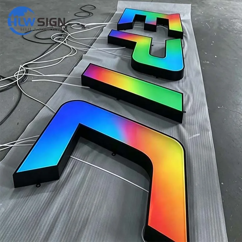
For storefronts that need maximum legibility, our 3D channel letters combine depth with even illumination.
They do not have time to read a long message, analyze complicated graphics, or understand a confusing logo.
They only have a few seconds.
In that short moment, your store front sign must answer three questions:
- What is this business?
- Is it worth remembering?
- Should I come back or stop here?
This is the foundation of the 3-second rule in storefront signage design.
A successful commercial sign is not simply visible. It is memorable.
For retail stores, restaurants, hotels, and service businesses, the right signage design can transform a passing driver into a future customer.
Professional signage organizations such as the International Sign Association emphasize that effective signage plays an important role in business visibility, communication, and brand recognition.
In 2026, businesses are increasingly investing in custom illuminated storefront signage for retail businesses because storefront signs have become an essential part of customer acquisition, not just a building decoration.
What Is the 3-Second Rule in Store Front Sign Design?
The 3-second rule means that a person should understand the essential information of your sign within approximately three seconds.
For a driver passing by, your sign needs to communicate:
- Brand name
- Business category
- Visual identity
- Professional quality
A successful store front sign usually follows three principles:
1. Simple Message
A driver cannot process too much information at speed.
The most effective signs usually include:
- clear brand name
- recognizable logo
- readable typography
Avoid:
- excessive text
- complicated graphics
- thin decorative fonts
2. Strong Visual Contrast
Visibility depends on:
- letter size
- color contrast
- lighting
- background materials
For outdoor commercial signage, contrast is especially important because signs must perform under:
- daylight
- evening conditions
- different viewing distances
Research on high-traffic signage design shows that readable fonts, strong contrast, and proper placement significantly improve visual recognition.
3. A Memorable Brand Element
The strongest storefront signs usually have one element people remember:
- unique typography
- signature color
- distinctive logo shape
- special lighting effect
A memorable sign becomes a landmark.
1. Large, Clear Typography Wins the First Three Seconds
Typography is one of the most important elements of a storefront sign.
When customers see your business from a vehicle, they do not read every detail.
They recognize:
- shape
- spacing
- proportion
- brightness
This is why professional brands often choose:
- dimensional letters
- channel letters
- illuminated logos
instead of simple flat graphics.
Why 3D Letters Are More Memorable
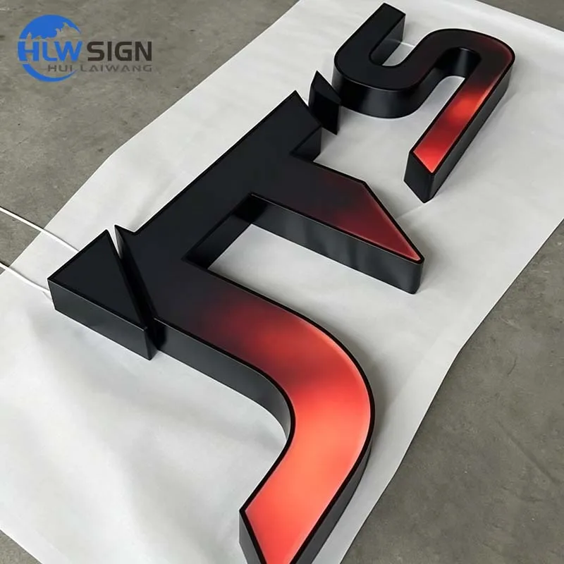
Three-dimensional lettering creates:
- depth
- shadow effects
- stronger visual identity
Compared with printed signs, raised letters appear more premium and architectural.
Common options include:
- stainless steel letters
- aluminum dimensional letters
- acrylic illuminated letters
For brands seeking a premium appearance, HLW Sign provides customized dimensional signage solutions designed for commercial storefront applications.
2. LED Illumination Helps Your Brand Stay Visible Day and Night
A storefront sign must work 24 hours a day.
A sign that looks good during daytime but disappears at night loses valuable customer opportunities.
This is why modern businesses increasingly choose LED-based solutions.
Compared with traditional fluorescent systems, LED signage provides:
- lower energy consumption
- longer operating life
- better brightness control
- more design flexibility
The U.S. Department of Energy explains that LED lighting technologies can significantly improve energy efficiency compared with traditional lighting solutions.
3. LED Channel Letters Create Strong Brand Recognition
One of the most effective solutions for modern storefront applications is LED channel letters.
They are widely used because they combine:
- visibility
- durability
- customization
- professional appearance
A well-designed channel letter sign allows businesses to customize:
- letter height
- material finish
- lighting effect
- mounting style
Common options include:
Front-Lit Channel Letters
The acrylic face illuminates directly.
Advantages:
- maximum visibility
- strong daytime appearance
- excellent value
Suitable for:
- restaurants
- retail stores
- shopping centers
Back-Lit Halo Letters
Light projects onto the wall behind the letters.
Advantages:
- premium appearance
- elegant nighttime effect
- architectural feeling
Suitable for:
- hotels
- luxury brands
- corporate buildings
Front and Back Illuminated Letters
Combining both lighting effects creates maximum impact.
This option is popular among brands that want their storefront to become a visual landmark.
Businesses looking for professional custom illuminated storefront signage for retail businesses can explore HLW Sign’s LED channel letter solutions, which combine metal fabrication, waterproof LED systems, and customized finishes.
4. Material Selection Determines How Customers Perceive Your Brand
A storefront sign communicates quality before customers enter your business.
Different materials create different brand impressions.
Stainless Steel: Premium and Architectural
Recommended for:
- luxury retail
- hotels
- corporate headquarters
Popular finishes:
- brushed stainless steel
- brushed gold
- champagne gold
- black titanium
Advantages:
- premium appearance
- corrosion resistance
- long service life
Aluminum: Durable and Cost-Effective
Aluminum is widely used for:
- channel letters
- outdoor logos
- commercial signs
Advantages:
- lightweight
- corrosion resistant
- recyclable
- suitable for outdoor applications
Acrylic: Excellent Light Diffusion
Acrylic is commonly used for illuminated faces because it provides:
- even lighting
- smooth appearance
- color flexibility
The right material combination allows businesses to balance:
- appearance
- durability
- budget
5. Store Front Signs Should Match the Building and Interior Design
A common mistake is designing a sign separately from the store environment.
In 2026, successful brands treat signage as part of the complete customer experience.
The exterior sign should connect with:
- facade materials
- interior colors
- lighting atmosphere
- brand personality
For example:
Luxury Fashion Store
Recommended:
- brushed gold letters
- warm halo lighting
- minimalist design
Modern Coffee Shop
Recommended:
- black metal letters
- warm LED illumination
- natural materials
Medical or Professional Building
Recommended:
- clean typography
- stainless steel finishes
- neutral lighting
Retail design experts also emphasize that consistent exterior branding and interior experience help create stronger customer memories.
6. How to Design a Store Front Sign That Attracts Customers
Many businesses ask:
“How to design a storefront sign that attracts customers?”
The answer is not simply making the sign bigger.
A successful design considers:
Viewing Distance
Letter size should match:
- road speed
- pedestrian distance
- installation height
Lighting Strategy
Choose lighting based on:
- location
- brand style
- surrounding environment
Brand Consistency
Your sign should match:
- logo
- website
- packaging
- interior design
A consistent visual identity improves recognition.
7. Avoid These Common Store Front Sign Mistakes
Too Much Information
Drivers cannot read paragraphs.
Keep the message simple.
Poor Font Selection
Avoid:
- overly thin fonts
- complicated scripts
- low contrast colors
Ignoring Night Visibility
A beautiful daytime sign may disappear after sunset.
LED illumination should be considered from the beginning.
Choosing Materials Only Based on Price
The cheapest sign is not always the lowest-cost solution.
A durable sign reduces:
- maintenance
- replacement
- downtime
The Future of Store Front Sign Design: Memorable, Durable and Experience-Driven
The 3-second rule shows one important truth:
A storefront sign does not need to tell customers everything.
It needs to make them remember something.
The most successful signs in 2026 combine:
✓ Clear typography
✓ Strong brand recognition
✓ Premium 3D design
✓ Energy-efficient LED lighting
✓ Durable materials
✓ Architectural integration
A professional store front sign is not simply a business name on a wall.
It is your first salesperson.
If you are planning a new storefront project, you can send your logo, storefront photo, and dimensions to HLW Sign through our custom sign quotation page. Our engineers can recommend the right material, lighting style, and structure for your application.